.svg)

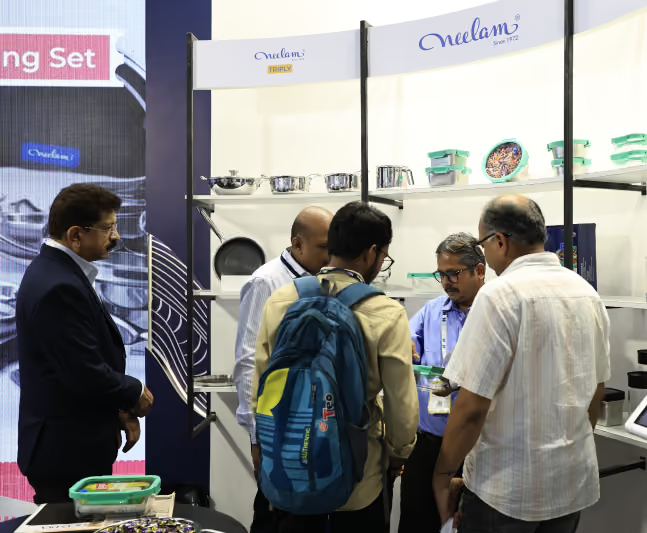
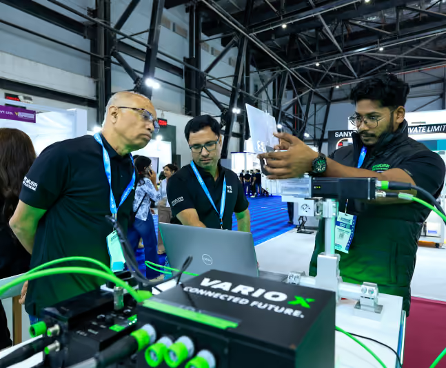
Most exhibition stands are effectively decided long before the first visitor walks into the venue. By the time the build begins, countless decisions have already been locked in, right from the layout and messaging to product placement, meeting areas, and visual hierarchy.
The challenge is that these decisions are often made around internal priorities. Marketing wants stronger branding, sales want more products on display, and leadership wants maximum visibility. Very few decisions begin with a simple question: How will visitors actually experience this space?
When there are too many ideas simmering, it will inevitably lead to poor visitor engagement.
“When designing a booth, you have to understand how visitors experience an exhibition stand through curiosity, movement, and split-second decisions,” notes Navin Chandwani, founder of Blues N Coppers.
Effective exhibition stand design starts by understanding visitor behaviour before deciding how the stand should look. When layouts, messaging, circulation, and interactions are designed around how people naturally move and make decisions, engagement becomes the outcome of good planning and not good luck.
Why Visitor Engagement Starts with Design
Every exhibition visitor follows the same process of scanning, assessing, and deciding.
Before reading a headline or speaking with your team, visitors have already formed an opinion about your booth. According to research published by the Center for Exhibition Industry Research (CEIR), attendees make rapid decisions about which exhibitors deserve their attention, making first impressions one of the strongest drivers of booth traffic.
This means booth design isn't simply about aesthetics; it influences behaviour.
A well-designed exhibition stand quietly answers several visitor questions within seconds:
- Is this relevant to me?
- Can I easily enter?
- Is something interesting happening?
- Will spending time here be worthwhile?
If those questions aren't answered quickly, visitors simply continue walking.
This is where visitor psychology becomes important.
People naturally gravitate towards open spaces, visible activity, intuitive pathways, and environments that feel easy to explore. Conversely, cluttered layouts, blocked entrances, excessive branding, or confusing navigation create subtle psychological friction that discourages engagement.
Great exhibition stand design does benefit from being loud, but it's more about reducing the effort required for visitors to engage.
Glitching on the psychology of design can land you among the low footfall booths. Let’s look at misses that cause such losses and simpler tactics to boost the engagement that you and your team desire.
Mistake #1 – Designing Only for the Brand
One of the most common mistakes is assuming an exhibition stand exists solely to showcase the brand.
The result is often predictable.
Oversized logos dominate every wall. Product displays compete for attention. Marketing messages cover every available surface. Every design decision prioritises corporate identity over visitor usability.
While these booths are very visible they are not particularly inviting.
Visitors don't attend exhibitions to admire branding. They attend to solve problems, discover ideas, compare solutions, or learn something new. If the environment feels like one large advertisement, many choose not to engage at all.
Consider two companies exhibiting side by side.
The first fills its stand with product specifications, awards, and oversized branding.
The second uses open spaces, live demonstrations, comfortable discussion areas, and clear messaging focused on customer outcomes.
Both communicate the same brand.
Only one communicates it through an experience.
From our hands-on experience, visitors are more likely to approach stands where they immediately understand what's in it for them, rather than simply who the exhibitor is.
“Visibility is important, but you have to be smart about it. It has to be in tangent with accessibility since that’s what creates engagemen,” adds Navin. “Branding has to shape the entire experience; not become the entire experience."
The strongest brands influence:
- Visual identity
- Material selection
- Colour palette
- Storytelling
- Emotional experience
But they don't dictate every functional de sign decision.
When branding leads and visitors follow, engagement suffers.
Mistake #2 – Designing Only for the Visitor
On the opposite end of the spectrum, designing only for the visitor can be a mistake.
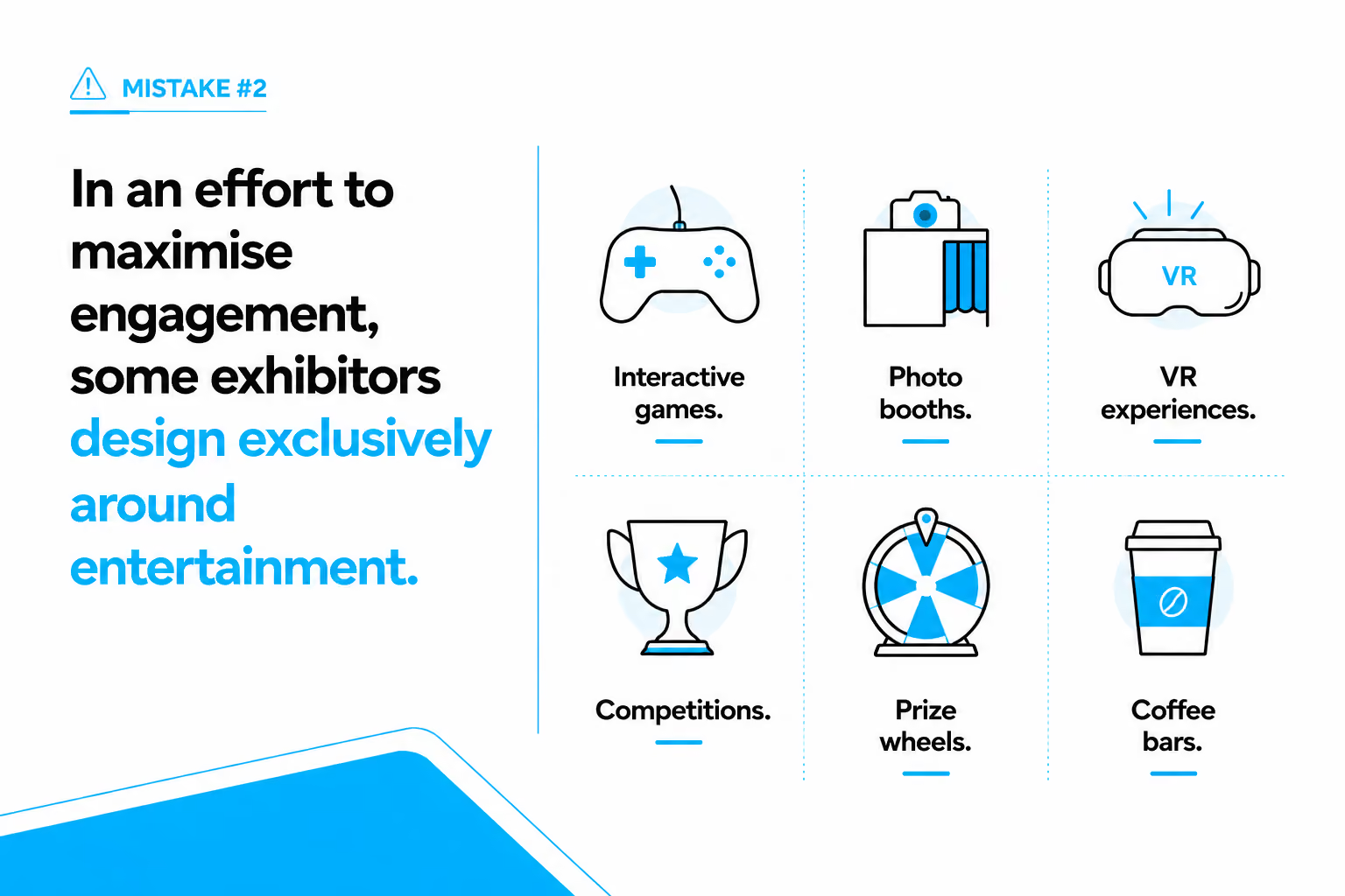
These attractions successfully draw crowds.
Unfortunately, they don't always attract the right audience.
Booths can be packed with visitors who happily participate in activities before leaving without understanding the company's product, remembering its message, or speaking with the sales team. High footfall doesn't automatically translate into qualified leads.
Imagine attending a technology exhibition where one stand features an exciting racing simulator. People queue enthusiastically. Afterwards, ask five participants what the company actually sells.
Many won't know.
That's a missed opportunity.
Good engagement should move visitors through a deliberate journey:
Attraction → Exploration → Conversation → Qualification
If that journey ends after the attraction, the booth has entertained rather than marketed.
An effective exhibition booth design balances interaction with communication. Interactive elements should reinforce the brand narrative—not distract from it. A sustainability company might demonstrate its technology through an immersive product experience. A manufacturing business could allow visitors to interact with digital production simulations. A healthcare company may use touchscreen diagnostics to explain complex processes. Each activity creates engagement while strengthening brand understanding.
A useful principle we've observed across exhibitions is simple:
Visitors drive function. Brands drive meaning.
Both are necessary.
Mistake #3 – Ignoring Layouts
Let’s talk about layouts. Poor exhibition booth layout affects almost every measurable exhibition outcome, like lower dwell time, fewer conversations, missed product demonstrations, and reduced lead generation.
Common issues include:
- Congested Entrances
Reception counters, display units, or furniture positioned directly at the entrance create psychological barriers. Visitors hesitate before entering spaces that appear crowded.
- Dead-End Layouts
Some booths unintentionally trap visitors in narrow walkways or force them to retrace their steps. People naturally avoid spaces that appear awkward to navigate.
- Hidden Demonstration Areas
Live demonstrations positioned behind walls or enclosed meeting rooms lose visibility. Visitors are far more likely to join an activity they can already see happening.
- Poor Circulation
Displays positioned without considering natural movement often create bottlenecks. Instead of encouraging exploration, they interrupt it. Some stands outperform others no matter the size simply because their layouts make movement effortless.
In one of our collaborations with Accurub, instead of filling every square meter with products, the design team created a wide entrance with three sides open. We placed a high LED wall that could be visible from any angle of the hall and it had products showcase on the other side of it. Entry was easy and we had 5 strategically placed podiums visible from multiple aisles.
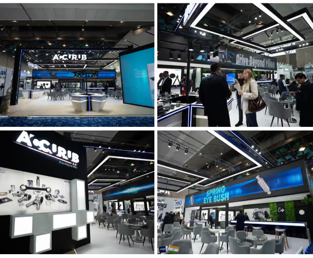
Not only did the booth have lots of visitors, but it was also able to hold more conversations per visitor. That is the distinction that matters. Every additional second visitors spend comfortably exploring your booth increases opportunities for discussion, qualification, and meaningful engagement.
In many cases, improving booth visitor flow delivers greater performance gains than increasing stand size or investing in more elaborate visual features.
Mistake #4 – Showing Everything, Everywhere, All at Once
When brands invest heavily in an exhibition, there's a natural temptation to showcase everything they have to offer.
Every product. Every service. Every award. Every testimonial. Every technical specification.
The intention is understandable. If visitors can see everything, surely they'll find something relevant.
In reality, the opposite often happens.
Visitors don't experience information sequentially—they absorb it selectively. When confronted with too many competing messages, they struggle to identify where to focus. Instead of exploring further, many simply move on.
We've seen exhibition stands where product displays covered every wall, digital screens played multiple videos simultaneously, brochures overflowed from counters, and messaging competed from every direction. While every element was valuable individually, together they created cognitive overload.
Effective exhibition stand design follows the same principle as good storytelling. It introduces one idea at a time, encouraging visitors to naturally discover the next.
Visitors don't need more information.
They need clearer priorities.
A useful question during exhibition stand planning is:
"If a visitor remembers only one thing about our brand after thirty seconds, what should it be?"
Design everything else around reinforcing that answer.
Mistake #5 – Failing to Create a Visual Anchor
Visitors rarely walk through an exhibition with the intention of studying every booth. More often, they're scanning the hall from a distance, subconsciously looking for something that captures their attention before deciding where to head next.
This is why every exhibition stand should have a single, highly visible element that draws the eye from across the hall. It could be an oversized product display, a striking LED wall, kinetic lighting, a suspended feature, or even a bold architectural element. The objective isn't simply to stand out; it's to give visitors a reason to look your way.
However, attracting attention is only half the equation. Once a visitor notices your stand, there should be something happening that encourages them to come closer. A live product demonstration, an interactive experience, or a small crowd engaged in conversation creates social proof and reinforces curiosity. People are naturally drawn towards activity because it signals that something worthwhile is taking place.
We've often observed that the highest-performing stands combine these two elements seamlessly. The visual anchor captures attention from a distance, while visible engagement keeps that attention long enough for visitors to change direction and approach the booth.
For example, imagine two exhibitors in the same aisle. One relies on large branding panels and static product graphics. The other features a suspended product installation visible across the hall, with a live demonstration taking place directly beneath it. Even before visitors understand what each company offers, they're far more likely to gravitate towards the second stand because it gives them both a reason to look and a reason to stop.
The key takeaway is that visibility isn't about making your logo bigger. It's about making your booth impossible to ignore and ensuring that what visitors see from a distance naturally invites them to discover more.
Mistake #6 – Neglecting Staff Interaction Zones
One element often overlooked during trade show booth design is where meaningful conversations actually happen.
Designers frequently allocate generous space to displays, technology, and branding while leaving little room for staff to comfortably interact with visitors.
The result is familiar.
Sales conversations take place in walkways.
Product demonstrations block entrances.
Small groups unintentionally discourage new visitors from entering.
Awkward layouts make discussions feel rushed instead of relaxed.
We've consistently observed that successful booths create dedicated engagement zones. These aren't formal meeting rooms hidden behind walls. Instead, they're flexible spaces where conversations can begin naturally before progressing into more detailed discussions if needed.
For example, one technology client replaced a large product pedestal with two informal discussion tables positioned beside a live demonstration area. Visitors could observe the product, ask questions immediately, and continue conversations without disrupting traffic flow.
The number of qualified discussions increased—not because more people visited the booth, but because more visitors stayed.
Design should support the people delivering your brand experience, not simply the products they represent.
Mistake #7 – Prioritising Aesthetics Over Function
Beautiful exhibition stands regularly win admiration.
Functional exhibition stands generate business results.
The strongest projects achieve both.
It's surprisingly common to encounter visually striking booths that become operationally challenging within hours of the exhibition opening. Storage is insufficient, power cables remain exposed, meeting areas become overcrowded, technology fails because equipment wasn't properly integrated into the design, and staff struggle to move efficiently between visitor zones.
These aren't design failures. They're planning failures.
An impressive concept should never compromise day-to-day usability.
The best exhibition booth design quietly solves operational problems before visitors even notice.
Common Patterns We've Observed Across Exhibitions
After working across exhibitions spanning manufacturing, healthcare, technology, engineering, consumer goods, and industrial sectors, certain patterns emerge repeatedly.
Interestingly, these observations rarely align with common assumptions.
We've seen compact stands outperform larger competitors because they offer a clearer visitor journey instead of attempting to display everything at once.
We've seen mid-location booths attract more qualified conversations than premium corner spaces because their layouts encourage smoother visitor flow and better engagement.
We've also seen highly creative concepts generate less business than simpler booths designed around accessibility and purposeful interaction.
One recurring misconception is that higher budgets automatically produce better engagement.
In practice, thoughtful planning often delivers greater returns than expensive features.
Some of the highest-performing exhibition spaces we've observed share remarkably similar characteristics:
- Open, welcoming entrances rather than physical barriers.
- Clear visual hierarchy with one dominant message.
- Demonstrations positioned where surrounding visitors can see activity.
- Logical visitor flow that avoids congestion.
- Flexible discussion spaces integrated into the layout.
- Consistent storytelling from entrance to exit.
What stands out isn't extravagance.
It's clarity.
Visitors rarely remember every architectural detail of a booth. They remember whether the experience felt effortless, relevant, and worth their time.
The Balance for Best Exhibition Stand Designs
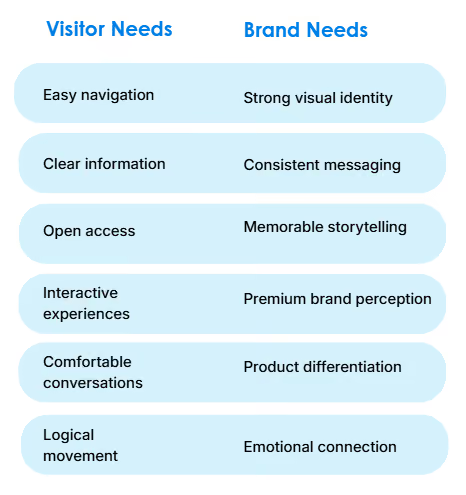
The Best exhibition stand design isn't created by choosing between visitor needs and brand objectives.
It's created by designing both together.
Visitors influence how a stand functions.
Brands influence what the stand communicates.
Ignoring either creates imbalance.
Visitors Should Influence:
- Overall layout and accessibility
- Entry and exit points
- Booth visitor flow
- Navigation through product areas
- Placement of interactive experiences
- Meeting and discussion zones
- Comfort and dwell time
These decisions reduce friction and make exploration feel natural.
Branding Should Influence:
- Visual identity
- Storytelling
- Messaging hierarchy
- Material selection
- Colour palette
- Emotional experience
- Brand personality
These decisions ensure every interaction reinforces who the company is and why it matters.
Neither list works independently.
Imagine an automotive supplier exhibiting new electric mobility solutions. The visitor-first approach might create intuitive navigation, visible demonstrations, and comfortable interaction zones. The brand-first approach shapes the architecture, materials, messaging, innovation story, and visual identity.
Together, they create an experience where visitors naturally understand the company's expertise while enjoying a seamless journey.
"Visitor behaviour and brand objectives should never compete. The strongest exhibition environments are designed where those two perspectives overlap. That's where meaningful engagement happens," notes Navin.
Visitor Needs vs Brand Needs Framework
The goal isn't compromise.
It's alignment.
When visitor psychology and brand strategy support one another, every design decision becomes more purposeful—and every interaction becomes more valuable.
Pre-Show Design Review Checklist
Before approving your next exhibition stand, ask:
✅ Is the entrance open and inviting?
✅ Can visitors understand our value proposition within five seconds?
✅ Is there a clear path through the stand?
✅ Are demonstrations visible from surrounding aisles?
✅ Are conversations easy to start without blocking visitor flow?
✅ Have we prioritised our most important messages?
✅ Does every interactive feature reinforce our brand story?
If the answer to any of these questions is "no," there may still be opportunities to improve engagement before fabrication begins.
Conclusion
As we've explored throughout this article, visitor engagement is shaped by dozens of design decisions from creating a clear visual anchor and intuitive visitor flow to balancing brand expression with functionality and avoiding information overload. Individually, these choices may seem small, but together they determine whether visitors walk past your stand or choose to step inside.
The most successful exhibition stands aren't necessarily the largest or the most elaborate. They're the ones designed around how people naturally see, move, explore, and engage. When visitor psychology and brand objectives are considered together from the earliest planning stages, the result is an exhibition experience that not only captures attention but also creates meaningful conversations and better business outcomes.
If you're planning your next exhibition, it's worth evaluating your stand beyond how it looks. Ask how it will be experienced. And if you're looking for a partner to help translate those strategic decisions into an exhibition stand that's both visually compelling and engagement-focused, the team at Blues N Coppers would be happy to help.
Frequently Asked Questions
1. How does exhibition stand design influence visitor engagement?
Exhibition stand design shapes first impressions, visitor flow, accessibility, and interaction opportunities. A well-planned stand encourages visitors to enter, stay longer, and engage in meaningful conversations.
2. What is the most important thing that I shouldn’t miss when planning exhibition stand designs?
When planning exhibition stand design, the most important thing is strategic layout. It’s what sets you apart from your competitors.
3. How can I improve visitor flow within my exhibition stand?
Use open entrances, intuitive pathways, visible demonstrations, and clearly defined engagement zones. Avoid barriers that interrupt natural movement through the booth.
4. Should exhibition stand design prioritise branding or visitor experience?
Neither should dominate. Effective exhibition stand design balances strong brand identity with layouts and experiences that support visitor behaviour and encourage engagement.
5. What design elements encourage visitors to stop at a booth?
Open layouts, clear messaging, live demonstrations, visible activity, interactive experiences, and welcoming staff all contribute to higher visitor engagement.
6. How do I know if my exhibition booth design is likely to perform well?
Review your design from a visitor's perspective. If it's easy to understand, simple to navigate, visually engaging, and supports meaningful conversations, it's far more likely to perform well.